Back in the early ’90s, I used a Daytimer system as both my work and personal planner. It wasn’t very pretty but it was very functional in keeping track of my hectic schedule at the time. Over the last decade, I’ve split my planning system into two so there was one planner dedicated solely to work and another for everything else in my personal life. It was around this time that I discovered ‘pretty planning’ which includes one of my favorite methods for keeping track of various things in my personal life: color coding. I have one color dedicated to each member of the family, one for all the pets, red for anything important, and blue for anything work-related that might cross over to ‘off-hours’. My work planner, however, stayed as plain as it always.
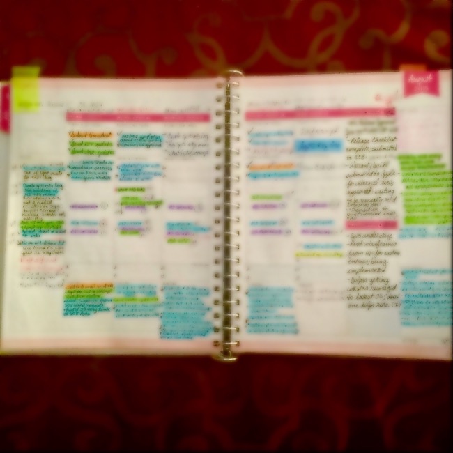
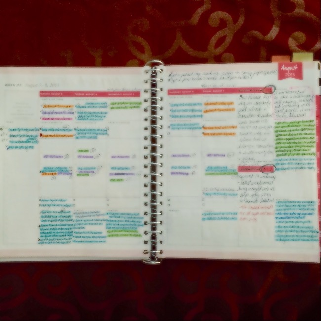
Fast forward to present day. One day I was staring blankly at my Day Designer work planner, completely overwhelmed by the multitude of tasks and notes for five different projects, my matrix organization, and my hiring organization when it dawned on me that having some sort of visual indicator could provide better organization. I already associated the color blue with the two projects I directly managed so what if I just assigned different colors to the other three projects and each organization? I chose three additional colors, gathered some highlighters, and started highlighting all the appointments, tasks, and notes, on my WO2P (week on 2 page) planner pages based on the project/organization. What. A. Difference. To say it worked out well would be an understatement. Now when I scanned my work schedule, I could quickly identify, separate, locate, and assess my workload by project and organization for the week. But I didn’t stop there.


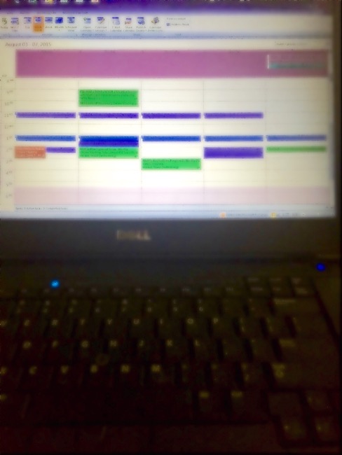
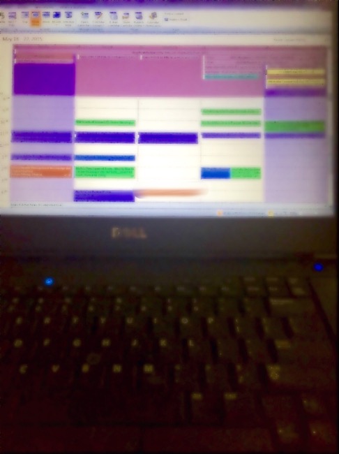
My work appointments are primarily managed in Microsoft Outlook which tends to be the norm in many large companies. Microsoft Outlook also has a way of color coding an appointment, event, email, etc. when you assign it to a ‘Category’. Users can rename Categories to anything they want and associate with a color of their choice. I took the color coding ‘key’ used in my paper planner and created Microsoft Outlook Categories using the same title and color (see pictures below; blurred to protect sensitive information). I then assigned it to every meeting and event invitation processed thru my eMailbox. BOOM!


When I split my planner system into two separate systems, it never crossed my mind to utilize some of the tips and techniques I was using in my personal planners. While I think it’s a waste to use things like washi tape, stickers, craft paper, and other ‘pretty’ things in my work planner–I need all the space I can get and if there were ever a legal matter involving a project, my work records could be subpoenaed and imagine the look on that judges face!–I still think there are some techniques that could really work in a professional work planner.
Do you keep a separate work planner because of your office environment? If so, do you use any ‘pretty planning’ techniques in your work planner that you’ve found helpful? Please share in the comments!

3 Comments on Using Color Coding at the Office