(*Note: This post may contain affiliate links. These links will help you find items I’ve purchased, use, and love!)
Choosing a planner for the New Year can be a very anxious time for many planner enthusiasts. Why? Because of all the choices we need to make–spiral or ring bound? personal or A5 size? weekly or daily pages? This brand or that brand? Of all these (and many other!) options to consider, there’s one choice that many find to be a ‘make or break’ decision when choosing a weekly layout: vertical or horizontal?

Why would a weekly layout be such a big deal? Choosing the wrong layout could lead to frustration if you’re constantly running out of room for tasks and appointments, have to split notes to make use of all available white space, find it difficult to locate information on a page, or it doesn’t align with your thought process. Let me explain. For the purposes of this example, I’m using my Inkwell Press 2015 and 2016 planner which is a brand that offers both layouts, to share the steps I took to choose the best option for me. These planners are great for fountain pen users as well as crafters who like to use stamps and markers given the thickness of the paper: 140 GSM (approximately 100 lbs) for the A5 inserts and bound planners; 70 lbs (approximately 100 GSM) in the booklets. If you’d like more information on these planners or would like to make a purchase and get a discount off your first order ($10 off first purchase, minimum $50), click the link provided above.
Horizontal Layout

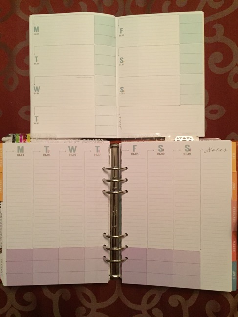
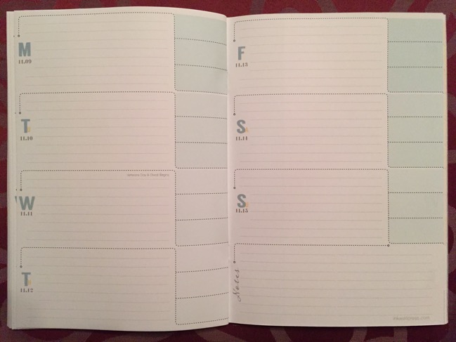
For 2016 I considered using a horizontal layout because my appointment schedule is not as busy as it used to be. Generally, I might have 1-3 appointments and tackle a few tasks a day with the occasional note written down for future reference. I was unsure, however, because I’ve also recently started a few side projects, each having their own related tasks and lots of notes that I try to track and dedicate time to on a weekly basis.
My concern with the horizontal layout was the lack of organization and space. Each day has several long lines, spread across the width of the page, that could make it difficult to create distinct areas to group and organized related information together. Despite having three mini-boxes per day (the light green boxes to the right of each day), they are each very small and only useful for capturing minimal information. Finally, each horizontal daily section just didn’t seem to have enough lines per day–just 9 in total. Sure, I could divide the lines in half thereby creating 18 lines per day but, again, the end result would be a smaller writing area. I also didn’t like the thought of having related information scattered throughout the daily section because there wasn’t enough space to create several distinct areas to organize it. Do I sound like an obsessive, type A, overthinker? Perhaps, but as planners geeks, aren’t we all? 😉
Vertical Layout

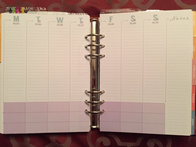
Let me start off by saying I am a list maker and work as a systems analyst by trade. This means my mind naturally takes a problem, breaks it down into smaller pieces, and reviews each one looking for patterns and relationships between them. Let me say that again: I start at the top and work my way down, grouping and organizing things logically as I go. Many in the planner community will say that if you’re a list maker and think in a top-down fashion, then vertical layouts will work well for you. What about having enough room to write? This layout also has the three mini-boxes which could be used to track something at the bottom of each day and 26 vertical lines! That’s 17 more than the horizontal layout or 8 more if you decided to split the horizontal layout in half to create more lines. (All this math is geeky, I know, but you have to admit it makes perfect sense!) The end result is that I have almost three times more writing space that can be divided into mini-sections for each day to keep related information together–e.g. appointments in the top 3 lines followed by my top 3 tasks for the day with the rest of the lines available for project task/note mini-sections and leaving the three min-boxes at the bottom for things like water tracking, exercise, and meal planning. Sold!
Walking thru my planning thought process and seeing how I could fit it into the target layout–like pieces of a puzzle–allowed me to see the limitations and abilities of each system. I did give the horizontal layout a try for at least a month as a ‘trial run’, with great difficulty, but it just didn’t work. I ran out of space, everything seemed ‘squished’ and blended together–it drove my analytical mind crazy! For users who have a small number of daily appointments/tasks or organize information into 2-3 categories, the horizontal layout will work well for you. As for me, I did manage to find the perfect system and I am proud to say I’m a ‘vertical’ gal! 🙂
What about you? Do you prefer a horizontal or vertical layout? Cast your vote below and share in the comments your preferred layout and why it works for you.
Hope you found this blogpost helpful! If you did and know someone else it could help, please like, subscribe, and share on social media.
Until next time,
♥ LilD ♥

Horizontal, definitely.
😉 Thanks for voting, Kristy. Love your blog!!!
Vertical. More efficient use of space. I’m a visual person and it’s clearer at a glance. Even if the width’s too narrow for some lists/notes there’s still room for more than one line per note. Also, in ring binders/arc systems I only have to write near them for 2 vertical sections as opposed to every line. 🙂
I completely agree with you, Antoinette. 🙂 Thanks for reading!