(*Note: This post may contain affiliate links. These links will help you find items I’ve purchased, use, and love!)
Happy holidays everyone! As we in the U.S. get ready for Thanksgiving, we are also brainstorming gift ideas for our friends and family. Well, I have you covered! For the next 5 weeks leading up to Christmas I will be sharing Santa’s Sleigh List which includes gift ideas for the planner addicts, fountain pen geeks, and techie nerds in your life. As a special bonus, I’ll also give you ideas for office grab bag gifts and unexpected guests so you don’t just impress your gift recipients, you’ll ‘slay’ them. 😉
To kick off this holiday series, I’m sharing my favorite fountain pen inks which include a shade from each color family.
Just as fountain pen geeks love collecting pens, they love collecting inks even more. 😉 Below are my absolute favorites from lightest to darkest:
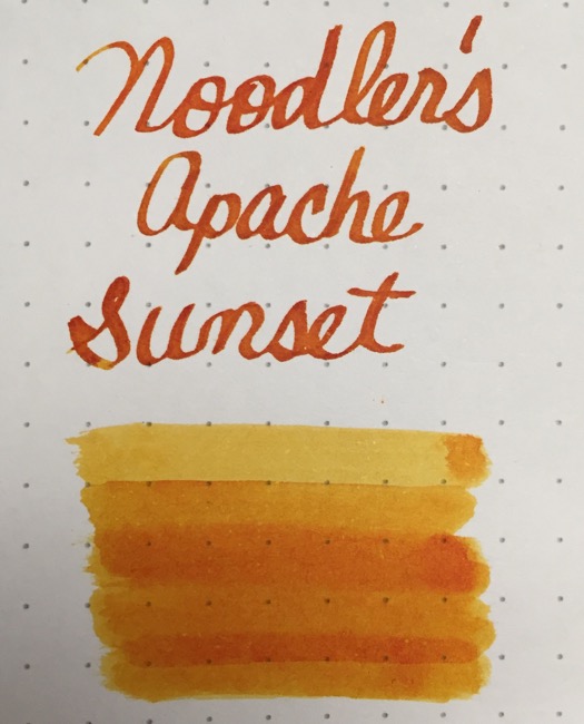
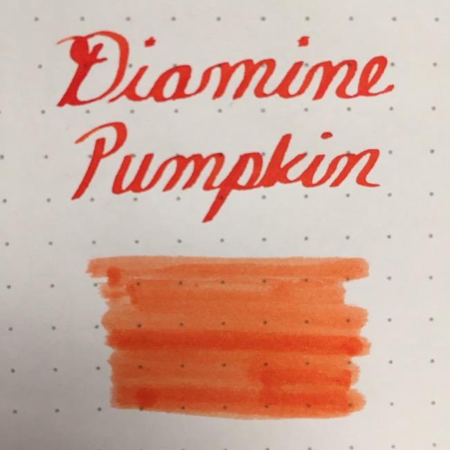
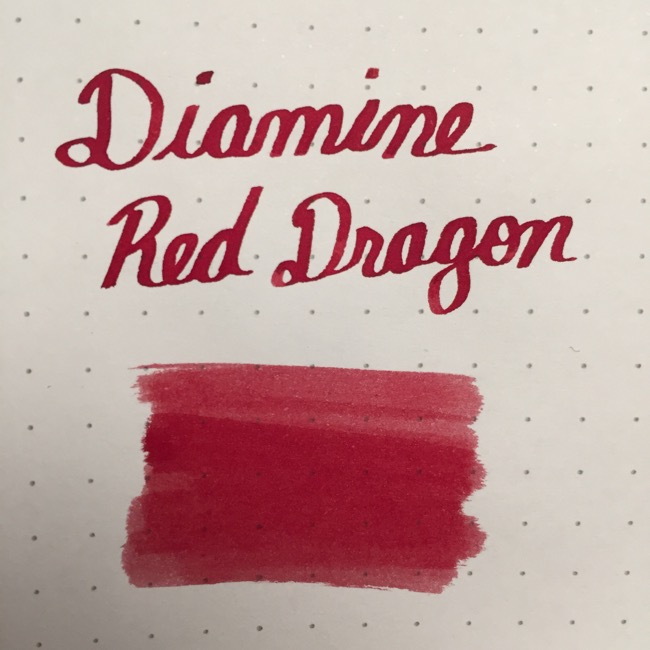
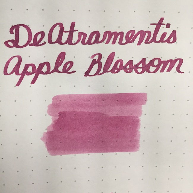
*Note: All writing samples were created using a Noodler’s Ahab fountain pen with a Goulet #6 1.5 Italic nib and each color swatch created using a Q-tip, swabbing once up to three times so it appears lightest to darkest from top to bottom on Rhodia dot grid paper pad.
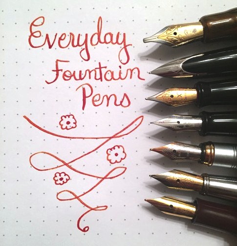
Just as the name suggests, this is an amazing shading ink whose color spectrum goes from yellow-to-orange-to-red like a beautiful tropical sunset. Depending on the nib size used (e.g. Fine, Medium, Italic, etc.) will determine which color in the spectrum is made prominent. My personal preference is to use a somewhat flexible F nib because it really brings out the red tones–to see what it looks like, check out the feature image from ‘My Everyday Fountain Pens’ blogpost also below; if you’d like to read it, click here. Using an M or Italic nib will bring out more of the orange tones with some yellow and a tiny bit of red.
This, for me, is the perfect shade of orange–not too bright, dull, or over the top. This ink is rich and deep enough to pop off the page and still be legible. It’s a gorgeous orange color to use from Spring thru Fall.
This red is the perfect true, warm red. Perfect for addressing Christmas cards, writing passionate love letters, or journaling on ivory paper for a vintage look. It’s not too bright and not too dark–perfection!
On the other hand, if you’re looking for a soft and muted pink for more of a romantic or feminine vibe, Apple Blossom is just right. Not too light, bright, or bubbly pink, this color is beautiful, warm pink that is easy to read and best of all, smells divine to add a little extra touch to those heart-felt notes or journal entries.
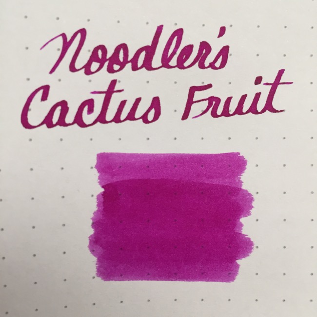
For the wild child at heart, here’s a gorgeous bright–but not too bright or neon–hot pink to fit the mood. It’s the perfect color to show off a youthful, playful side, and bring a smile to their face every time they put pen to paper.
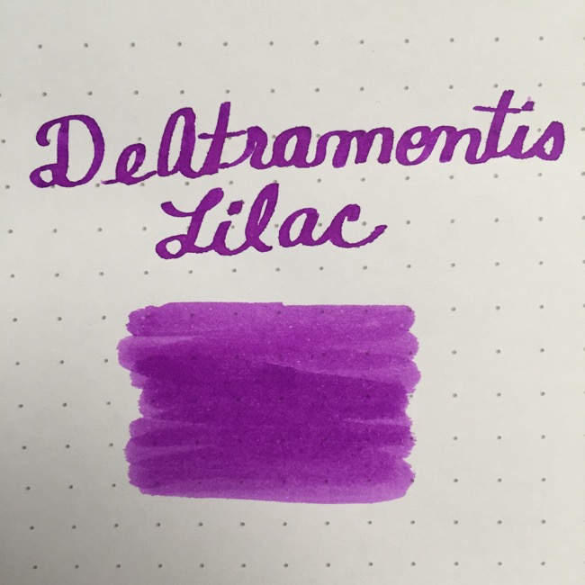
If purple is more their speed, this ink fits the bill nicely. It’s a lovely purple-pink color, not too light and not too dark, that looks amazing on crisp white paper and best of all, has an intoxicating scent of lilac–ahhh!
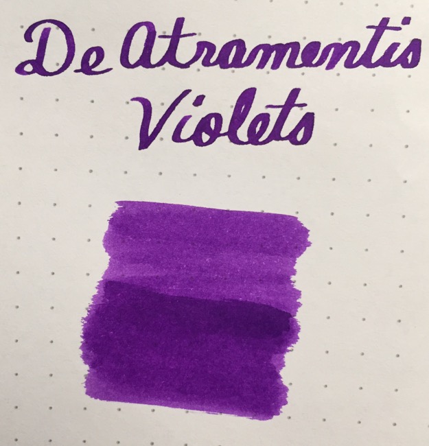
Need a purple that is more ‘work appropriate’? Try Violets for a darker, richer purple that has a touch more blue to make it suitable for taking notes in a planner or padfolio but just enough ‘oomph’ to stand out among the standard blues and blacks.
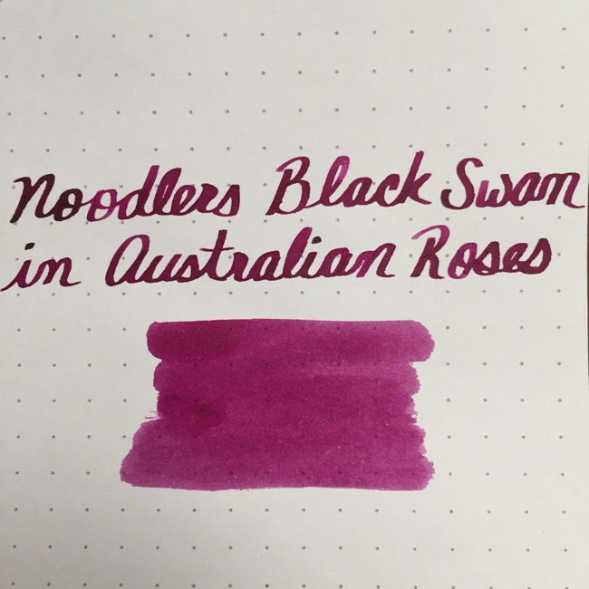
Noodler’s Black Swan in Australian Roses
I may be a little biased here because my favorite color is burgundy but I consider this ink the best of the bunch! After sampling MANY burgundy inks, I fell in love with this one for being the perfect warm, burgundy-wine. It’s also a shading ink which gives it a lovely medium-to-dark color spectrum. I use this ink in many different fountain pens of varying nib sizes and adore how it flows from every single one. This is definitely my favorite of all time!
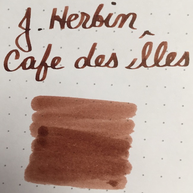
As an avid coffee drinker, this was another color that I went on the hunt for to find the perfect shade. I sampled many different brands and shades of brown but this turned out to be the perfect warm, golden, true brown that was not too light that it leaned yellow or too dark that it seemed almost black. This is my second favorite of all time and I’m sure it will be theirs too!
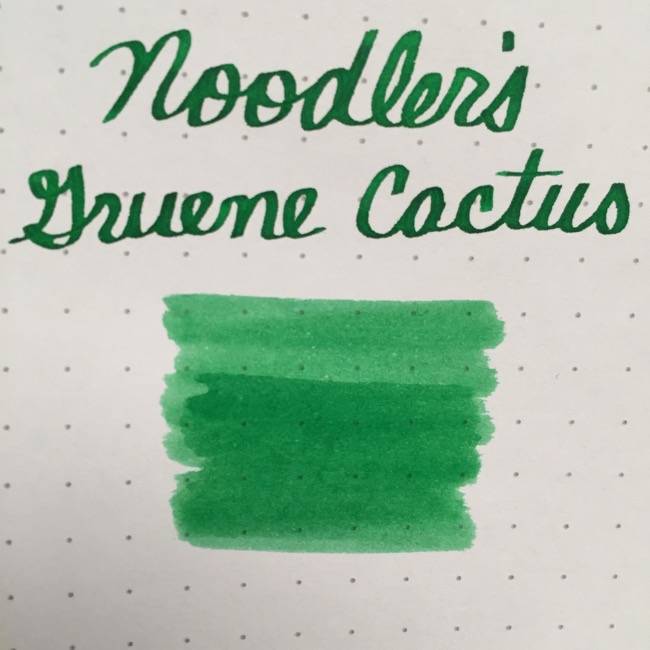
Want an equally festive alternative to red for those Christmas cards? How about green! This is a wonderful true green that is not too light or dark. Perfect for Christmas, Spring, Summer, and Fall, this is a lovely, cheerful green to brighten any gloomy day.
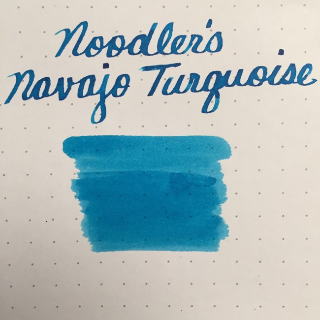
Whether it’s memories of Jack Frost or the ocean, this ink is the perfect shade of turquoise to make blue just a touch more fun. Sure they can write in [dark] blue every day but we’re talking ‘kicking things up a notch’ for those that really love blue so give this ink a try.
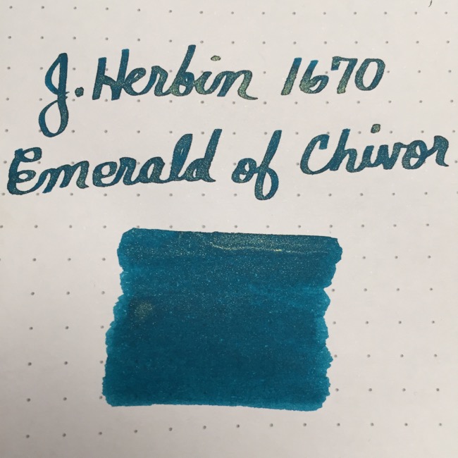
J. Herbin 1670 Anniversary Ink Emerald of Chivor
If you’re looking for something truly stunning, look no further than this anniversary ink which premiered the summer of 2015 by J. Herbin. Below is a writing sample and swatch which is beautiful–you can see the gorgeous gold shimmer embedded within the lovely teal-blue-green shade–however if you want to see the truly magical shading effects of the mind-blowing (yes, I said mind-blowing!) ink, read my previous blogpost featuring this ink on Tomoe River paper here. (Trust me, you HAVE to see the pictures in the blogpost!)
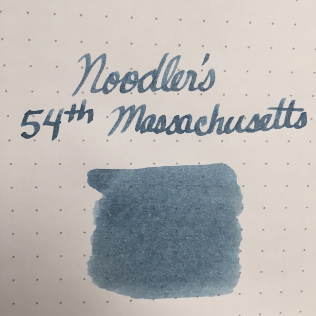
For those that want or need a more ‘traditional’ dark blue with a bit of pizzazz, try Noodler’s 54th Massachusetts. The writing sample below demonstrates that when used with a broader nib, the shading is more obvious giving it a lighter appearance. However when using an F or M nib, the color is a darker blue-black that is more classic and professional.
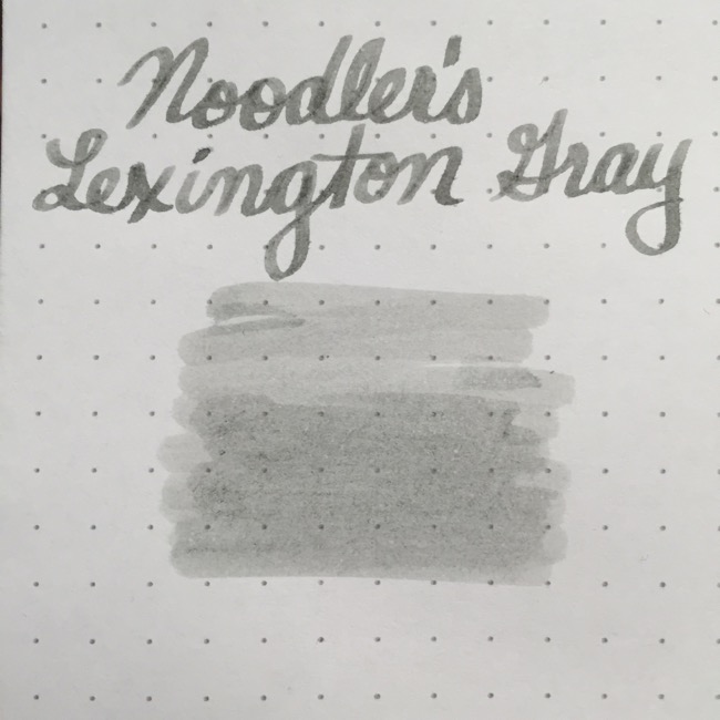
When using mainstream pens, people generally choose between blue and black. When faced with these two choices, I consider myself a ‘blue ink gal’ because I find black too boring and harsh (no offense to those who love black! I just prefer blue :-)). In lieu of black, I discovered this wonderful medium gray shade from Noodler’s. I love using this ink in both fountain pens and brush pens–used for sketches/drawings–because the result is as if you had used a pencil. It’s a soft, subtle effect for those who find black to be too harsh and artists who prefer something more permanent. Again, the swatch below appears a lighter because it was done with a broader nib. Using an F or M nib will make the shade appear like a darker gray.
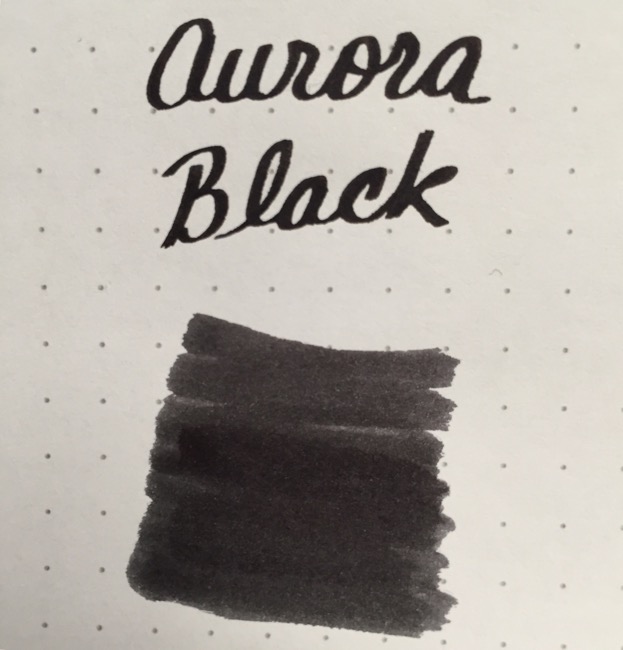
While not my personal preference, black is a popular choice for both business environments and many casual pen users so, of course, I had to include a recommendation or this list would not be complete. Aurora Black is a very dark, rick, true black that just pops off the page to create a stunning contrast. If you’re looking for a great black, this is the one!
I hope you found this holiday list helpful in finding the perfect fountain pen ink to gift someone special or even just a gift for yourself. 😉 If you did and know someone else it could help, please like, subscribe, and share on social media. Fountain pens provide the unique experience of not just an artistic expression on paper but the ability to experiment with beautiful and unusual inks so bring a little holiday ink cheer to your favorite fountain pen geek!
Come back next week for Part Two of the holiday gift guide!
Until next time,
♥ LilD ♥

