
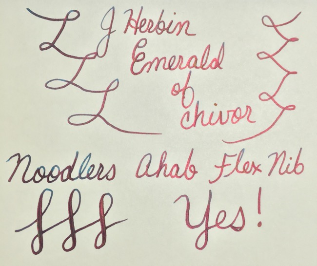
If you’re a fountain pen geek, you were probably aware and very excited about this year’s summer release of J.Herbin’s newest 1670 anniversary ink which promised spectacular shading. For those who are not familiar with the term ‘shading’, it refers to the ability of an ink to lay down a variation of color. While there are many popular shading inks available, few are as unique as J.Herbin’s new Emerald of Chivor.

Emerald of Chivor is part of the J.Herbin 1670 Anniversary line. This ink shades to include colors such as teal, turquoise, green, red, and gold–yes, finely milled gorgeous gold! The wider the nib, the more shading you get but to bring out the red tones and experience the true ‘magic’ of this ink, it’s best to use it on Tomoe River paper. I used a Nanami Seven Seas Notebook containing cream colored Tomoe River Paper to test different nibs–you can learn more about this notebook and paper here.
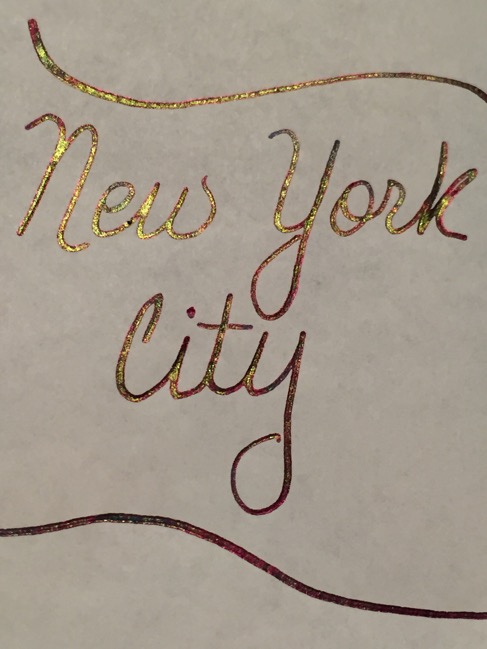
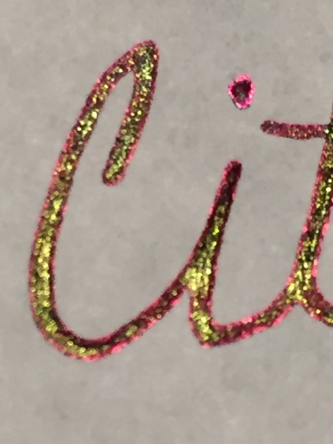
My moment of ‘awe’ happened when I was journaling in my Midori travelers notebook chronicling a recent trip to New York City. I inked up my Noodlers Ahab pen with my new ink and sat down to journal in my Midori 013 insert which has Tomoe River paper. Oh. My. Gosh. I had written two pages worth and just stared in awe at the color variation that had spilled out on the page. It was hard to believe that so many different color combinations had emerged from just one pen and ink: shades of turquoise with red, teal with gold, red with gold, all colors together, etc. Such beauty! That inspired me to go a step further to see the affect different nibs would have on this unusual ink.
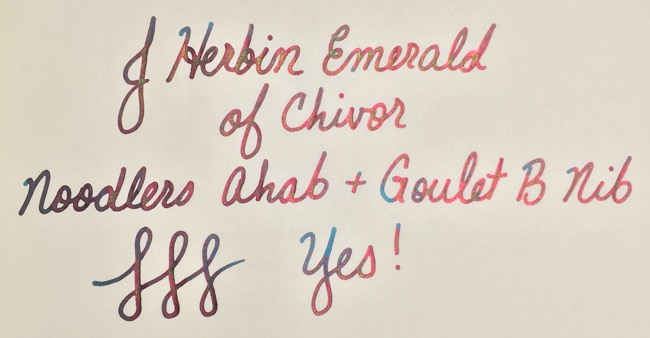
I was so impressed with the results in my Midori that now I was REALLY curious to see what else this beautiful ink could do. I pulled out my assortment of Goulet nibs to test in my Noodler’s Ahab.
First up, I used the standard Noodler’s flex nib. My Ahab is a very wet writer so the shading came out a medium dark red and teal–due to the saturation level–sprinkled lightly with gold which made the red sparkle rather than appearing as a true gold.
Next up was the Ahab with the Goulet B (broad) nib. The shading was still mostly a medium dark red and teal with a little bit of green and gold.
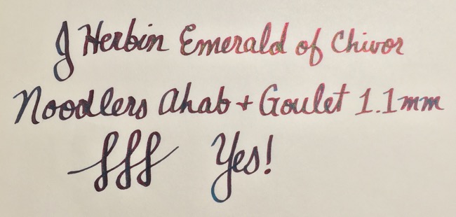
Next were the italic nibs. Using a Goulet 1.1mm italic nib, I started to get a much broader line with varying shades of teal, red, turquoise, green, and gold. Now I was getting somewhere!
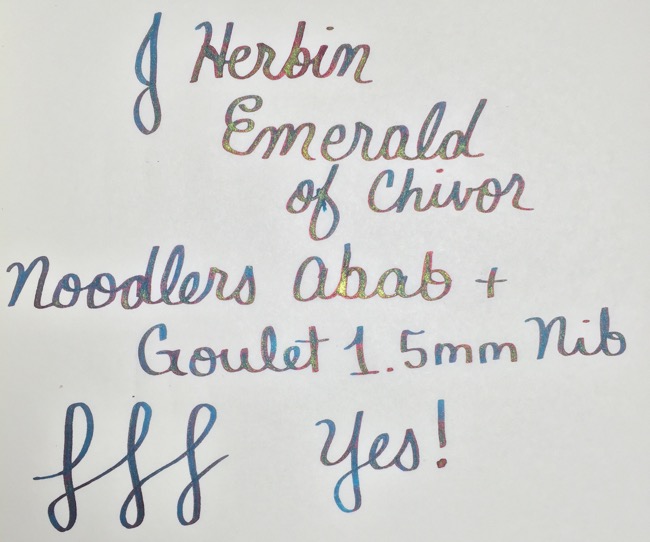
Lastly, I changed to the Goulet 1.5mm italic and that seemed to expose the ‘sweet spot’. Out came luscious lines of teal with hints of red, turquoise, green and saturated in gold. It was definitely a thing of beauty and my favorite result of all the nibs I tried. However, I noticed that my Ahab appeared to be ‘gushing’ more than usual–the ink shined visibly around the feed but it did not spill out onto the paper. I’ll need to monitor this nib to see if there’s a chance the ink will spill out of it while writing so in the meantime, I’m storing it nib-up in a pen cup to keep it under control between uses.
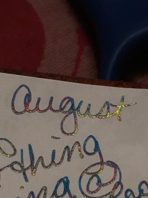
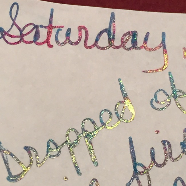
Taking pictures of this ink proved to be challenging–I tried different lighting, locations, and angles and while I was able to capture the ‘jist’, trust me when I say that the pictures don’t do it it justice! It is definitely more impressive in person. Also, be aware that these were just my personal results. I’ve seen other fountain pen reviewers and online sellers whose pictures showed different color variations which is a further indication of the complexity of this ink. That said, the J.Herbin 1670 Emerald of Chivor ink is DEFINITELY worth adding to your collection and I can’t recommend it enough. Try it with different pens, different nibs, different papers (though I highly recommend the Tomoe River paper!) until you find the combination that you like.
Have you tried the new J.Herbin 1670 Emerald of Chivor Ink? What was your experience? Share in the comments below!
5 Comments on J.Herbin 1670 Emerald of Chivor Ink